A gorgeous floral fabric can look surprisingly different depending on which way you cut it. The flowers might feel nicely scattered in one direction, while the stems and branches seem to run the wrong way. Rotate your layout, and suddenly the design flows better, but you may have more obvious repeats.
That is exactly the decision I ran into while cutting rayon for skinny scarves. These are fairly quick, simple projects, but choosing the print direction took a little more thought than I expected.
Can you cut across the grain to prioritize a directional print? In select circumstances, I will. That does not mean ignoring grain lines for every sewing project. It means considering the fabric, the finished item, and the visual tradeoffs before committing to a cut.
Key Takeaways
- Print direction and fabric grain are separate considerations when planning your cuts.
- Cross-grain cutting can be a deliberate choice for certain accessories, not a general rule for garments.
- Compare motif flow and folded placement before committing fabric to a cutting layout.
Print Direction and Fabric Grain Are Different Things
When you are new to sewing, it helps to separate two decisions: how the fabric is constructed and how the printed design looks.
- Lengthwise grain: Runs parallel to the selvage, the finished edge of the fabric.
- Cross grain: Runs perpendicular to the selvage, across the fabric’s width.
- Print direction: The way the flowers, branches, or other printed elements appear to travel across the fabric.
For apparel, the general rule is to follow the grain line marked on your sewing pattern. I would not treat print placement as a blanket reason to rotate garment pieces however they happen to look prettiest.
For these scarves, though, I am working with woven rayon fabrics with minimal stretch. This is a small accessory rather than a fitted garment, and it is not something I expect to launder frequently. In this particular situation, I am comfortable choosing between lengthwise and cross-grain strips based on the print.
The scarves finish at about 39 inches long, so the design has a long, narrow space to fill. A direction that looks lovely across a whole yard of fabric may not look quite as good once it becomes a skinny strip.
The Blush Floral: Why I Chose to Cut Parallel to the Selvage
My first fabric is a Rifle Paper Co. floral with a soft blush background, colorful flowers, strawberries, and leafy stems. It is gorgeous, but I had a hard time deciding which direction would work best for the scarves.
I started by cutting two strips 5 inches wide, perpendicular to the selvage. Cutting across the width is convenient because I can take one strip at a time without setting aside a longer section of yardage for the whole batch.
There was something I liked about those first strips: the print looked more varied and random. The flowers and colors were distributed in a way that felt less repetitive.
But the stems and branches ran across the narrow strip instead of along its length. To my eye, that made the plant elements feel cut short. If they had traveled diagonally, I probably would have been fine with it. This particular orientation just bothered me.
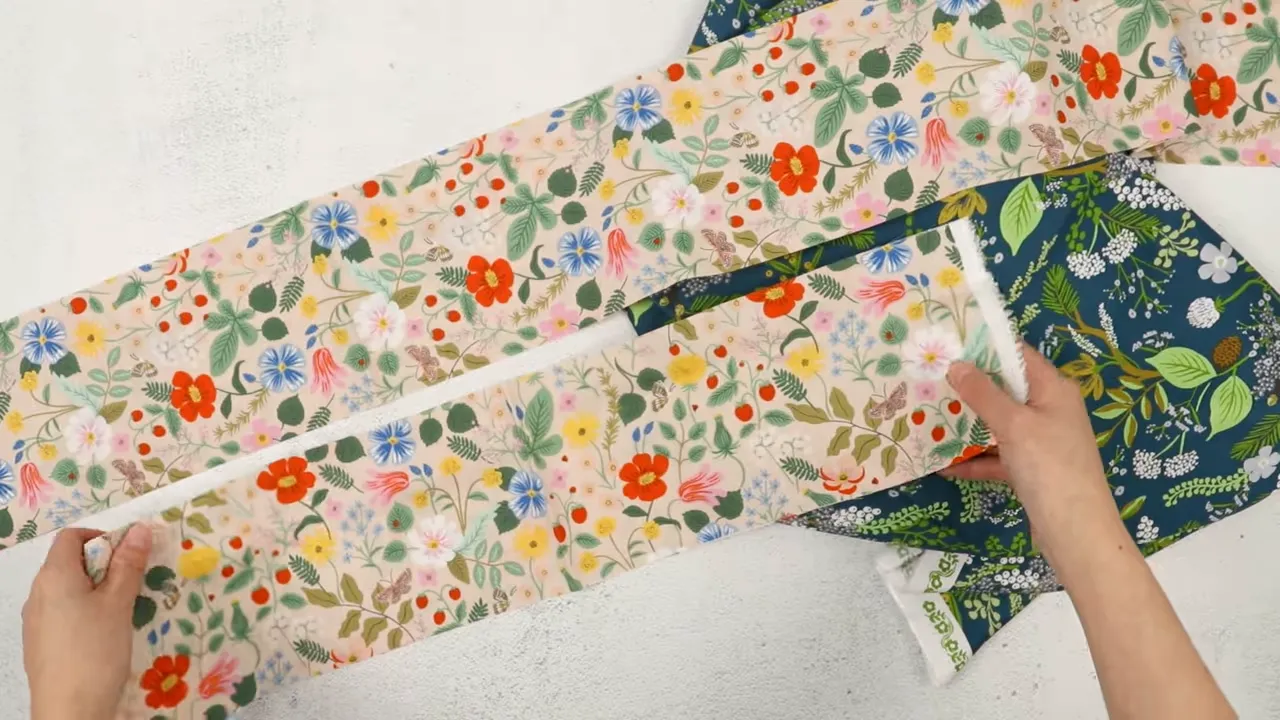
When I compared those pieces with a strip cut parallel to the selvage, I preferred the lengthwise flow of the design. The stems and branches felt better suited to a long scarf.
The Better Direction Still Had a Tradeoff
The parallel cut was not perfect. It created more noticeable repeating elements down the length of the strip. Once the fabric was folded lengthwise, one side had more colorful flowers and variety, while the other was a little less interesting.
I would have loved a slightly more random arrangement with that same lengthwise flow. Between the two options, though, I preferred the direction of the stems over the extra variety in the cross-grain strips.
That is an important part of working with directional print fabrics: you may be choosing the best compromise, not finding one flawless layout. Fabric is personal. Something that bothers me might not bother you at all.
Cutting Lengthwise Commits More Fabric
For the lengthwise layout, I set aside about 41 inches along the selvage, then cut that section into 5-inch-wide strips running parallel to it.
That commits a longer section of fabric to the scarf project than simply cutting one crosswise strip. I was fine with that because I planned to make several scarves. If you only want one, you may not want to divide up your yardage that way.
There is also the option of fussy cutting: deliberately positioning your cut so a particular flower, strawberry, or other detail lands in the piece. If there is a motif you really want included, check its placement before cutting rather than hoping it ends up in the right spot.
The Teal Botanical: Why I Chose the Opposite Direction
The second fabric called for a different decision. This one has a teal background with branches, berries, flowers, and leaves. I had about a yard to work with.
After spreading it out and locating the selvage, I felt the botanical elements would flow better along the scarf if I cut the strips perpendicular to the selvage. Same type of project, different print, opposite choice.
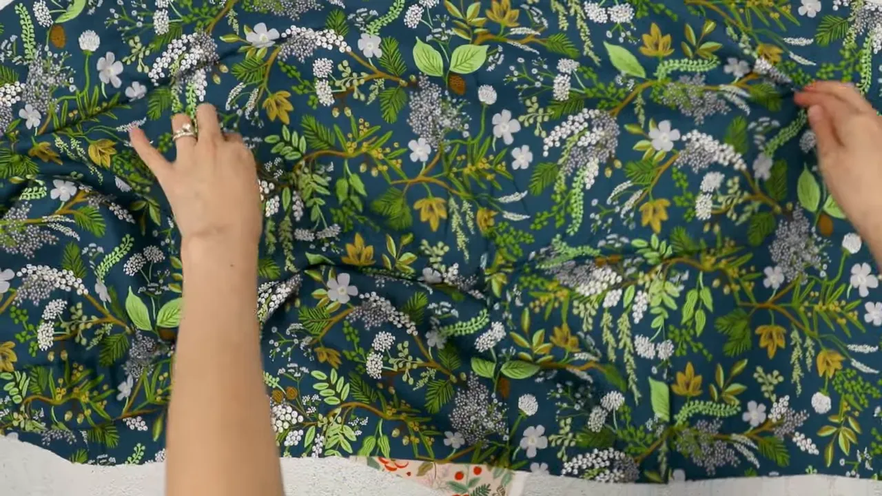
This layout was also easier for my cutting plan. I could cut one 5-inch strip across the width, then another, without committing a full scarf-length section of yardage first.
My plan was to press the fabric, fold it in half selvage to selvage, and cut the strips across the width. The important thing was not repeating the choice I made for the blush floral. It was looking at this print on its own.
Some prints look equally good in either orientation. Others have a stronger visual direction, even when they are made up of lots of little scattered elements. Look at the stems and branches as well as the flowers. They may be what makes one layout feel more natural.
What This Rayon Is Like to Work With
I purchased these fabrics myself, and this is not sponsored. I am a big fan of the Rifle Paper Co. rayons I have used. The teal print is from the English Rose collection, and the fabric is printed on one side. I believe its width is about 44 inches, though I would check the listing for the particular fabric you are buying.
What I like about it:
- It has a lovely drape for scarves and other small accessories.
- The finish is fairly matte rather than shiny.
- It feels a little silky, although it is not silk.
- It is not super slippery and has been pleasant to sew and press.
The downside is that it wrinkles fairly easily. Thankfully, I also find it easy to press. Before cutting, I want those wrinkles out so I can lay the fabric out properly.
It can still be a little tricky to cut, so keeping the fabric still matters. Being pleasant to sew does not mean it will stay perfectly in place without attention.
For more print options, Rifle Paper Co. is worth a look. I have also enjoyed working with Cloud9 rayon, which I find a little more expensive, and Figo Fabrics rayon. These are fabrics I like for their quality and drape, whether I am making clothing, scarves, or scrunchies.
Before You Cut, Picture the Finished Project
My biggest recommendation is to judge the print in the shape it will actually become. A full piece of fabric gives you one impression. A long, narrow strip gives you another. Fold that strip lengthwise, and the balance of flowers and colors can change again.
Before committing the rest of your fabric, ask yourself:
- Which way do the motifs flow? Look at stems, branches, and other connecting elements, not just the most colorful flowers.
- What happens when the piece is folded? Check which details will be visible on each side.
- How much yardage does the layout commit? Consider whether you are making one item or several.
- Is the grain choice appropriate for the project? A decision I make for a simple scarf is not automatically one I would make for a garment.
As for those first blush floral strips, I am not planning to use them for scarves. They may become scrunchies instead, where the gathered fabric makes the print direction much less important.
Sometimes you try a layout and realize, “No, that is not quite it.” That does not make the fabric useless. It just means it might be better suited to something else.
Be mindful of the grain, give the print a little attention, and make a deliberate choice for your project. There is room for personal preference here. And whatever you are making, keep it fun.


