Embroidery can look almost identical on the front of the fabric and completely different on the back. I knew upper thread tension mattered, but testing the same monogram at different settings made that difference really obvious.
This started with a cute fringe embroidery font and a plan to monogram some towels. Several hours of stitching later, I had samples from both the Brother Skitch and Brother PE900, a much better visual reference for tension, and some doubts about whether this particular font would work for my project.
Not exactly the quick project I had in mind! But the experiment was useful, especially for understanding why a design that looks fine on top might not have the thread distribution you need underneath.
Key Takeaways
- Upper thread tension changed the backs of my samples far more than their fronts.
- Tighter settings exposed more bobbin thread but did not fully solve the fringe-finishing problem.
- Labeled test samples provide a useful visual reference before committing to a finished project.
Why This Fringe Font Sent Me Down a Tension Rabbit Hole
I was testing a letter B from a fluffy fringe embroidery font. The intended finishing process is a little different from ordinary embroidery:
- Stitch the design.
- Cut the bobbin thread on the underside in the areas specified by the design.
- Pull the released upper threads through to the front.
- Fluff those threads to create the fringe.
The problem was that I could barely see the white bobbin thread in some areas on the back. Instead, most of what I could reach was the colored upper thread.
For a regular design, I usually focus on whether the right side looks good and whether bobbin thread is showing where it should not be. With this fringe font, though, access to the bobbin thread was part of making the design work. The underside suddenly mattered a whole lot more.
What Upper Thread Tension Changes
In my samples, changing the upper thread tension changed how much bobbin thread was visible on the back of the embroidery.
- Looser upper tension: More colored upper thread appeared on the underside, with little or no white bobbin thread visible.
- Tighter upper tension: More white bobbin thread became visible on the underside.
- On the front: Most of the samples still looked surprisingly similar.
That last point is what made this experiment so interesting. If I had only compared the fronts, I could easily have missed how much the settings changed the stitching underneath.
The embroidery tension rule of thirds
A commonly used visual guideline for the back of a satin-stitch column is the rule of thirds. Across the width of the column, the intended balance is approximately:
- One-third upper thread along one side.
- One-third bobbin thread through the center.
- One-third upper thread along the other side.
That gives you something concrete to look for when comparing samples. In my tests, even the tightest settings did not consistently produce that distribution. More importantly for this project, they did not expose bobbin thread everywhere I needed to cut.
Changing Tension on the Brother PE900 and Skitch
On the Brother PE900, I could adjust the upper thread tension for the design from the machine’s screen. The control is accessed through the icon that looks like thread with scissors. That area also includes the end-color trim and jump-stitch trim settings, so be sure you are selecting the tension control.
The PE900 settings I tested were:
- 0.0: The lowest available setting, giving very loose upper thread tension.
- 4.0: The default setting, which I normally leave alone.
- 9.0: The highest available setting.
I deliberately tested the extremes to make the differences easier to see. That does not mean 9.0 is the setting I recommend for everyday embroidery. It was an experiment, not a new default. After demonstrating the range, I returned the setting to 4.0.
The Brother Skitch uses a tension dial rather than the PE900’s numbered on-screen adjustment. Without numbers on the dial, I could not record the settings with the same precision. For those samples, I compared the usual setting with very loose and very tight tension.
My Brother Skitch Tension Test Results
I started on the Skitch, stitching the same yellow B monogram at different tension settings. On the front, the samples looked much alike. There was not a dramatic visual difference between the loose, default, and tight versions.
Flipping them over told a different story:
- Loose tension: Hardly any bobbin thread showed on the back.
- Default tension: A little white bobbin thread was visible.
- Tight tension: This exposed the most bobbin thread of the three.
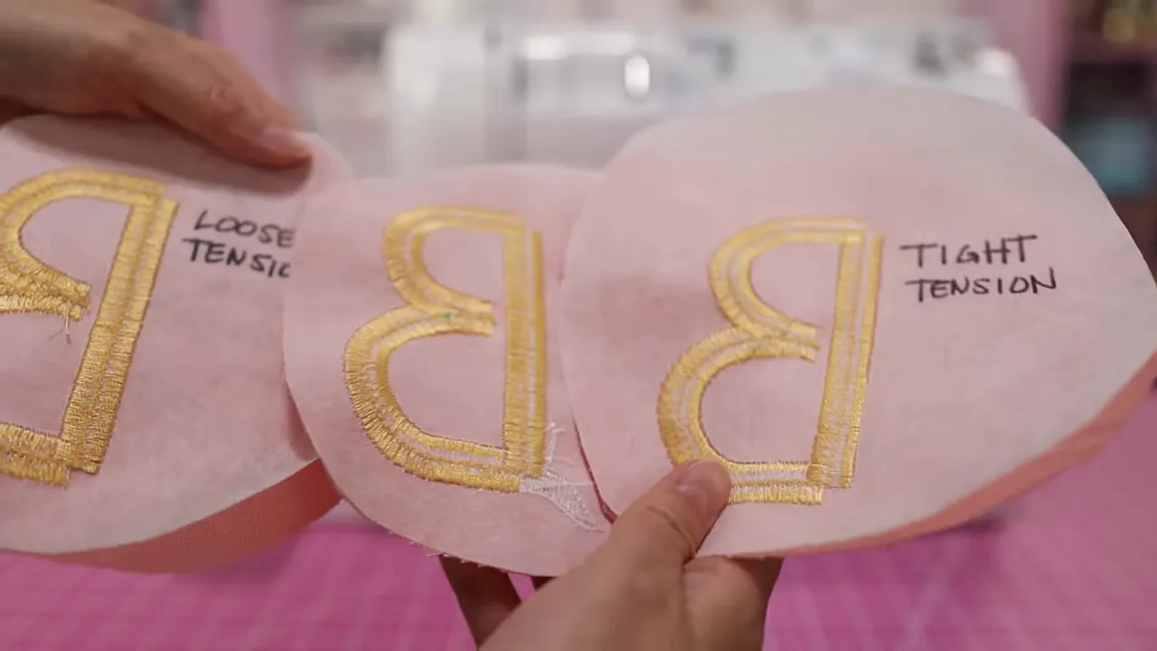
Even on the tightest setting I tested, the bobbin thread did not look like a consistent third of the column. There were sections where I could probably cut it, but other sections offered mostly yellow upper thread.
That left me with a practical problem: cutting along the back as intended would mean cutting upper thread in some places, too. I was not confident that would give me the fringe effect I wanted.
My Brother PE900 Tension Test Results
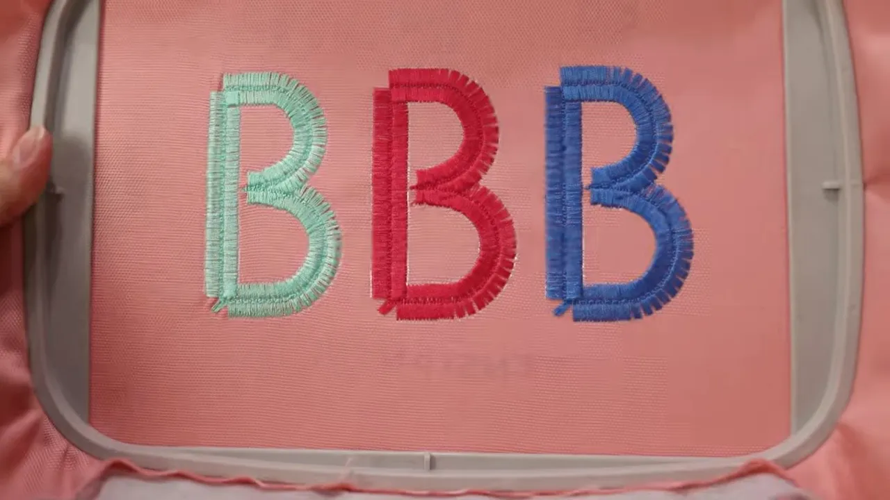
Next, I switched to the PE900 to see whether its tension range would expose more bobbin thread. I stitched the same B three times in one hoop, using different upper thread colors to distinguish the samples:
- Blue: 0.0 tension.
- Red: 4.0 tension.
- Mint green: 9.0 tension.
Again, the fronts looked fairly similar. The default sample looked uniform, and the loose sample looked much the same. The tightest sample did show a little puckering, which was worth noting.
The backs showed the stronger contrast:
- 0.0 tension: No visible bobbin thread on the underside.
- 4.0 tension: Very little visible bobbin thread, still less than I wanted for this fringe technique.
- 9.0 tension: The most visible bobbin thread, but with uneven distribution around the letter.
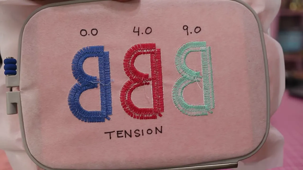
At 9.0, parts of the straight column looked accessible for cutting. Other areas, including portions of the upper curve, still had little or no exposed bobbin thread. Turning the tension all the way up had helped, but it had not solved the whole problem.
How the Two Machines Compared
Putting the samples side by side, the PE900 appeared to have a wider range of upper thread tension in this particular experiment.
- At the tight end: The PE900 exposed more bobbin thread in parts of the design than the Skitch did.
- At the default setting: The Skitch exposed a little more bobbin thread than the PE900.
- At the loose end: The Skitch still showed a small amount of bobbin thread, while the PE900 showed essentially none.
These were observations from my samples, not a universal ranking of the machines. Both produced fairly similar results overall, and neither gave me consistently accessible bobbin thread throughout this design.
That distinction matters. The PE900’s wider apparent range did not automatically make it the answer for this particular fringe font.
What Happened When I Cut and Fluffed the Fringe
I went ahead and tried finishing the tight-tension Skitch sample. Using curved bent scissors, I cut along the underside where I could access the bobbin thread. Then I used a large needle to tease the released threads through to the front.
It did create some fringe. So the idea was working, at least partly. But I was getting raw cut thread ends as well as the loops I had hoped for.
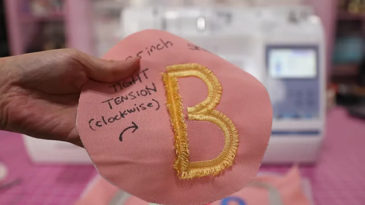
For towels, that made me hesitate. I had not tested how the result would wash, and I was not sure the cut ends would give me the finish I wanted after laundering. The font looked adorable in the listing photos, but my own sample was not convincing enough to commit to the towels.
I may need a different font for this project. Sometimes the useful result of a test is finding out that a design is not the right fit before putting it on the actual item.
The curved bent scissors I used are a tool I reach for all the time, and I sell them in my Sewing Report Etsy shop if you would like to pick up a pair.
Keep Your Test Samples as a Tension Reference
One thing I am glad I did was label the samples with a permanent marker. I recorded the machine and tension setting, then cut the individual Skitch samples apart so I could compare them easily.
If you are doing a similar test, make the samples useful beyond that one sewing session:
- Repeat the same design so you have a clear visual comparison.
- Label each sample with the machine and tension setting.
- Inspect both sides rather than judging only the finished front.
- Try the finishing technique before deciding that the stitch-out is successful.
- Save the samples as a reference for future projects.
My biggest lesson was not that every embroidery project needs endless tension adjustments. I normally leave my PE900 at its default setting, and this test did not turn the maximum setting into a better everyday choice.
Instead, it showed me that a good-looking front does not tell the whole story, especially when a specialty design depends on what happens underneath.
These are hands-on observations, not a machine diagnosis. I am not a sewing machine technician, so for help with a specific Brother machine problem, the Brother Product Support Center is the appropriate place to ask.
Was spending several hours stitching the same B what I planned? Definitely not. But now I have a much clearer picture of what those tension settings actually do. Test first, keep the useful samples, and whatever you are making, make it fun.


